Although Fronzoni’s work is often met with fanaticism, there are some who view his monastic purism suspiciously. However, both factions have absorbed his teaching more than they think, in that it consists not so much in a fight against the superfluous as in orthopedics carried out on things, oneself and others (Translation by Isobel Butters).
Among the Italian graphic designers active during the last century, A G Fronzoni was the most radical disciple of the modern undertaking to make design one of life’s fundamental principles. Through an activity that one might consider as a long series of exercises, Fronzoni clearly outlined the analogy between design and ascetic practice, or rather between the design of things and the design of the self, providing an example to be imitated by generations of designers. This is perhaps the real reason for the unique cult that surrounds his life and work, a cult that goes beyond the intensity and coherence of a work that sometimes contrasts with the rigid precepts of modernism. Here I propose to investigate, unfortunately only through secondary sources, the ascetic dimension of the work of Fronzoni the progettatore (as he liked to define himself), dwelling on the relationship between designing things, designing the self and designing others.
A G Fronzoni, poster for the series “Arte e Città”, 1979. Author of the photo unknown.
Designing things
During a working life that took place mainly in Milan, Fronzoni produced a vast number of logos, magazines, exhibition designs and objects, including the iconic ’64 furniture series in metal tubing. The high points of his work, however, are his posters – fifty of which inhabit the permanent collection at the Museum of Modern Art in New York – and his teaching. First at the Società Umanitaria in Milan, then at the Istituto d’Arte of Monza, followed by the Istituto delle Industrie Artistiche of Urbino and the Istituto di Comunicazione Visiva in Milan, and finally at the workshop school he set up in 1982 in Via Solferino, again in Milan. About his posters Fronzoni writes: “To design a poster, we need to start from architecture and return to it”. So he sees the poster as a space, inhabited by several elements (usually not many) set in relation to each other, and as a structure, as shown by the die cuts and the paper add-ons he used for some of them. As researcher Michele Galluzzo1 points out, Fronzoni witnessed the emergence of the new printing and drawing techniques, just as he experienced the ubiquitous diffusion of advertising accompanied by the growing hegemony of television. Although he was interested in these developments and drew on them for experimentation, Fronzoni did not allow himself to be greatly distracted and in this sense his work reads like a declaration of the universality of a timeless practice.
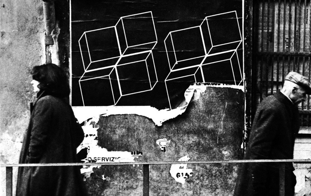
It would be reductive though to consider only these formal aspects. I would like to suggest therefore the hypothesis that the poster played a dual role. First and foremost it was the arena in which the designer practiced their skills, becoming expert in their battle against the ineffective, which is immoral and wasteful, obscene. Secondly, the poster was a way of reforming, or, indeed, purifying the world. In fact, Fronzoni’s mostly empty and colorless posters cover, and therefore amend, bits of world. Given that these posters now inhabit only the aseptic spaces of galleries or catalogues, it is not easy to legitimize my theory. The poster for Fontana’s exhibition at La Polena Gallery in Genoa, however, provides some sort of confirmation. Fronzoni pays tribute to the famous Fontana cut that makes the canvas a surface to be crossed, thus producing a world beyond. We are also helped by a photo from 1979 showing ripped posters affixed to a wall in Genoa – the geometric shapes floating on a black background seem to belong to a platonic dimension revealed through a gash. Is it the geometries of the poster that cover the chaos of the world or is it instead the chaos of things that prevents the hidden order from emerging? An illusion of depth reveals a vertical direction – covering means revealing at the same time. In one of his rare pieces of writing Fronzoni himself talks about black and white, of “new and unexpected realities” that recall the celestial mysteries of the night sky.
A criticism is often made of Fronzoni the graphic designer – that of having preferred an “enlightened” cultured clientele to the detriment of the “real” market, at least as regards his work in exhibitions and monographs. Would Fronzoni have succeeded in preserving his formal rigor if he had expanded his clientele? – ask the critics. Assuming it is a well-founded critique, it would confirm the ascetic vocation of A G’s posters, which not only perform a separation from chaos, but pay homage to all that is cultural, and, as such, to a value that indeed needs to be spread but also to be preserved. In this sense Fronzoni’s activity was revolutionary – his posters inscribed a world in the world, the latter to some extent separated from the first. Fronzoni aspired to “advertise culture”, and this was the purpose of the Genoa posters. But what kind of culture? The posters generate a culture made to be contemplated and absorbed but certainly not manipulated or inhabited. Fronzoni’s culture measures a distance. Certainly, “culture must be brought where there is none, to the fringes, to the weakest”, whose only task, however, is to drink it in. But then what is culture if not a code for initiates, an esoteric language? Fronzoni’s pure forms are symbols of the culture of those who are able to interpret, and of the culture that is lacking for those unable to understand. After all, Fronzoni knew better than anyone else that the void is worth as much as or perhaps more than the full.
Despite this, the graphic designer often encouraged his students to be hired by relatives or friends to design a logo or a sign – in other words he urged them to get their hands dirty. Here we see how the design of things and the design of others tie together. The purpose of Fronzoni’s work is fundamentally educational – the client is educated, the public is educated, and the educator himself is educated. The things designed and the context of this design are the medium of this pedagogic mission. Things teach the coherence that characterizes them. As Hannah Arendt argues, the public sphere is made up of things designed that both unite and separate. Fronzoni’s posters are an example of this simultaneous union and division. The user is united with the client through the poster, but it is the poster that establishes them as separate and asymmetrical entities. The asymmetry is vertical – in spite of the desire for inclusivity in Fronzoni’s work, what is designed exudes immutability and therefore authority. His posters for workers’ rights do not represent the workers’ requests other than through the filter of the designer’s competent eye. If it is minimalism, Fronzoni’s is an educational minimalism.
Designing the self
Hiding his given names (Angiolo Giuseppe) behind an acronym, the designer declared: “I am just a brand called A. G. Fronzoni” (later the periods disappeared as well). During his work as editor and designer for Casabella, he did the same with his colleagues A. Mendini and G. Celant because “in graphic design there is no room for diminutives or sentimental messages.” Indeed it was Mendini – who went on to distinguish himself for his sacrilegious and irreverent style and verve – who recalled the episode, describing a Fronzoni passionately involved in a very personal struggle of good against evil. A powerfully seductive holistic vision to which Mendini, like many other students of Fronzoni, was not immune. Defined from time to time as Orthodox, Franciscan and even Calvinist did not stop Mendini calling him Enlightened. There is only an apparent contradiction between these names – when rationality becomes a dogma, one can develop a cult around it whose nature is sometimes more intransigent than that of traditional religions. In this regard, the German philosopher Peter Sloterdijk, a supporter of the radical belief that religions are nothing but systems of exercise, notes that progress can be considered a kind of soft, non-radical conversion, “half-price metanoia” on a large scale, which can sometimes even become free entirely. Fronzoni, however, never settled for facile techno-humanistic optimism, and that is why his behavior is ascetic in the traditional sense – separatist, distant from the things of the world and yet immersed in it; what Max Weber called “inner-worldly asceticism”, meaning “an existence within the world but not of this world or for this world”.
Besides a firm belief in progress, A G’s quotes suggest he was not without a transcendent belief (“when man creates he is very close to God1”). His love for the essential seems to have coincided with a kind of Franciscan-style frugality (Massimo Curzi calls him “pauperist by nature”). This sense of moderation was reflected in his lifestyle. Fronzoni shunned material possessions and detested private property. He considered the dress of nuns, priests and friars to be the epitome of elegance. It was as if the aim was to vanish behind his black uniform and negate himself as an individual. The reform of the world apparent in his designs is nothing but a reflection of the reform of the self – a battle on two fronts.
What remains of Fronzoni’s philosophy are mainly apothegms handed down orally. There isn’t a great deal of writing but one example seeks to punish writer’s vanity. Entitled “How shameful to write”, it consists of an indecipherable text, which once again emphasizes form rather than content. A G solemnly states that “the greatest design is the design of ourselves”, that “we ourselves are our own designers, we work for ourselves”. After all, there is no difference between living and designing, because “designing is a way of being, a way of approaching life and society […]”. The book A lesson with A G Fronzoni by Ester Manitto, which is a student’s homage to her teacher of design and life, contains a sketch dedicated to her. The diagram summarizes the behavior of the Pistoia designer. Below is the horizontal dimension of work and fatigue (“work (slaving away) every day 8 hours a day”) with a vertical line rising up toward the very high end goal of quality. “You will be alone (always)”: the vertical path has to be traveled alone, warns Fronzoni.
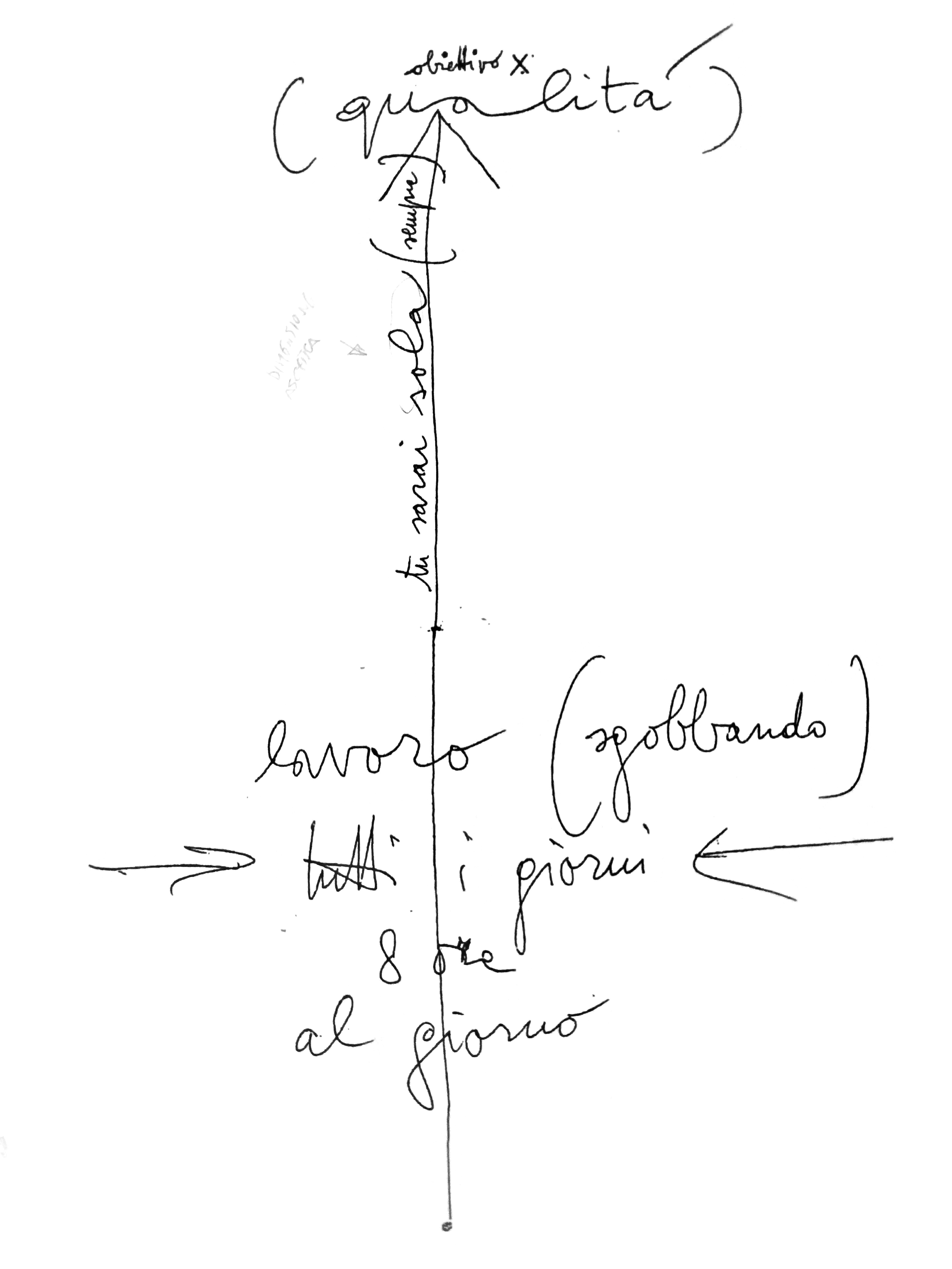
Diagram by A G Fronzoni dedicated to Ester Manitto, 1990.
Designing others
Known throughout the world for his simple and austere design language, the architect and designer Claudio Silvestrin mourns the disappearance of the master figure. But what kind of master are we talking about here? A G was undoubtedly in thrall to the charm of the Renaissance workshop, where the master was first of all a master craftsman, and one learned by doing. He never tired of repeating the motto, coined by John Dewey and endorsed by Josef Albers at the Bauhaus. Clearly, however, his teachings were not merely technical, embracing politics and ethics, anti-consumerism and the advocacy of culture. As Florencia Costa recalls in Domus, the focus of his teaching was on training the mind; it consisted of a series of instructions on what it means to be a human being.
Silvestrin is right to say that masters don’t exist anymore. But, seeing as how there are still people who want to perform this role and there is no shortage of those who feel the need, what is their disappearance due to? A master figure presupposes a clear, defined vision of things. The master keeps order. Fronzoni’s Manichaeism is unquestionably reassuring, and that is why it still grabs new generations of designers. Unfortunately, however, the Fronzoni cult is not devoid of nostalgia, and this makes him a melancholy subject. The religious community in which to put into practice the regula of Fronzoni, already shaky while he was still alive, gave way to a desert of relativism and to the vertigo of complexity and irony. We have developed ironic antibodies that immunize us from the grand intentions and high hopes, which now seem like faded Polaroids of the economic boom and post-boom (after all, Fronzoni was active during the 1970s, ‘80s and ‘90s, when this immune system was established). The orange peel of history is there to protect the optimistic aphorisms of Fronzoni, as it is with Munari or Steiner. How do Fronzoni’s words sound today? Can one still hear that “design is part of the verb to love” (progettare è voce del verbo amare, the title of one of his exhibitions) without having to stifle a condescending smile? Nowadays Fronzoni’s sincerity, the by-product of a rigorous conceptual frugality, is frightening and therefore it is given different levels, interpretations, relocations, and reappropriations.
We often come across a Fronzoni quote of somewhat dubious origin, according to which his ambition was not to design posters, but to “design people”. Surprisingly enough, no one is shocked, perhaps because the assertion is protected by the reassuring patina of a glorious past. What makes it obscene is that in a secular context that makes freedom an absolute value, nobody wants to be designed, not even by the purest of masters. And whoever would be so presumptuous as to try to design human beings? It is not hard to hear the echo of Soviet rhetoric about the New Man.
Doubts about the reliability of the quote derive first of all from Fronzoni’s anarchic sympathies, wherein he believed that autonomy is necessary and fundamental to a human being worthy of the name. Secondly, the idea of designing people contrasts with the more frequent and documented reference to art historian Giulio Carlo Argan, according to whom “those who refuse to design agree to be designed”. And yet it is precisely here that the divergence between the idea of the disciple designed by the master and the independence of the solitary disciple triggers a vicious circle. The master-coach encourages the disciple to design their own life so that it is not designed by others; but it is the same master-coach who then offers them a life plan. Fronzoni embodies the authority that, while designing your life, frees you because he makes you a designer.
Nowadays it is easy to find the ambivalence between designing and being designed in everyday life, where we discover that the two activities are not mutually exclusive. Advertising, for example, encourages us to design our consumption and through it our personality. In this way, it redesigns our intimate relationship with goods and with ourselves. When not openly manipulating us, publicity makes us disoriented actors. And what about school? Through school, the state designs interchangeable members of the public required to actively administer their life plan. In this sense, all schools are design schools. However, design schools in the strict sense generate a design surplus in the students, who reconsider or even deny their own function in society. The radical design lesson is received all too well, and thus the conceptual grid within which the teaching takes place is rejected: the very idea that autonomy passes through design is discredited. Other practices, methods and means are triggered, closer to the continuum of the diary than to the discrete subdivision of the project, which becomes the historic need of an increasingly fragmented labor market. The students, the smartest or the least well-equipped, depending on the point of view, reject design in order not to be designed. Can a pure, independent, contemplative ability to design exist? One that is independent of a socially imposed programming? If such a thing exists, it is to be found in the radical asceticism of the cenobites, the anchorites, or the stylites. For everyone else there are only promiscuous, distributed, social designs. We design ourselves while being designed.
Bibliography
“A G Fronzoni ovvero dell’essenziale.” Parete, September 1976.
Arendt, Hannah. Vita activa. Milan: Bompiani, 2017.(Eng.The Human Condition, University of Chicago Press,1998 [1958]
Costa, Florencia. “A G Fronzoni 1923-2002.” Domus, September 4, 2012. https://www.domusweb.it/en/design/2002/04/09/ag-fronzoni-1923-2002—.html.
Curzi, Massimo. Inventario per autori: A G Fronzoni, “Inventario”, nr. 9, July 2014.
Fronzoni, A G. “Che vergogna scrivere.” In Grafici italiani, edited by Giorgio Camuffo. Venezia: Canal & Stamperia, 1997.
Fronzoni, A G. “Diamo La Parola A…” C-R-U-D. Napoli, 1999. https://soundcloud.com/heather-for-c-r-u-d/diamo-la-parola-a.
Fronzoni, A G. “Il progettista grafico.” Sipradue, May 5, 1965.
Galluzzo, Michele. “I grafici sono sempre protagonisti? Pubblicità in Italia 1965 – 1985.” Università Iuav, 2018.
Gunetti, Luciana, and Gabriele Oropallo. “The City as a White Page: The Encounter of Typography and Urban Space in Italian Late Modernism.” Design History Society Annual Conference, Barcelona, Spain, 2011.
Koening, Giovanni K. “Carattere di un carattere anni ’20.” Casabella, issue 349, 1970.
Manitto, Ester. A lezione con A G Fronzoni. Dalla didattica della progettazione alla didattica di uno stile di vita, 2017.
Mendini, Alessandro. “Colorare A. G. Fronzoni.” Abitare (blog), July 28, 2009. http://www.abitare.it/it/design/2009/07/28/colorare-a-g-fronzoni/.
Sironi, Roberta. “b/n. Gli spazi di A G Fronzoni.”. Doppiozero (blog), October 16, 2012. http://www.doppiozero.com/rubriche/226/201210/bn-gli-spazi-di-ag-fronzoni.
Sloterdijk, Peter. Devi cambiare la tua vita. Milan: Cortina, 2010 (Eng. You must change your life. Polity 2009).
Waibl, Heinz. Alle radici della comunicazione visiva italiana. Como: Centro di Cultura Grafica, 1988.
Weber, Max. L’etica protestante e lo spirito del capitalismo. Milano: BUR, 2009 (The Protestant Ethic and the Spirit of Capitalism, Penguin 2002).
1 My thanks to Michele Galluzzo because, besides generously giving me material without which this article would not have been possible, he also provided useful starting points for the development of this unorthodox take on Franzoni’s work.
2 During a short talk in Naples, Fronzoni mentioned the Altissimo no less than three times.