Have a look at the new PublishingLab leaflet! Its design came out of a reflection on the PublishingLab’s role and attitude: during a series of conversations, the concept of ‘hybridity’ frequently emerged. Originally referred to the hybrid outputs of the publishing process (e.g. EPUB, POD, etc.), this concept can be extended to encompass also the various roles, practices, skills, methods, etc, that mingle when producing a publication. This expanded notion of hybridity is also rooted in the collaboration with the INC that took place during the Digital Publishing Toolkit project:
The dynamics of different reading practices and print or digital devices therefore demands hybridity in the practices of publishing and the goal of the INC subgroup was to connect the existing publishing practices and to suggest new ways of working.

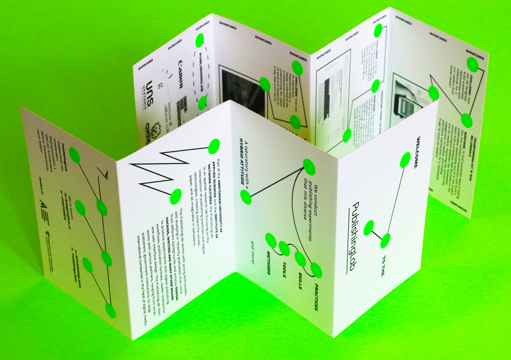
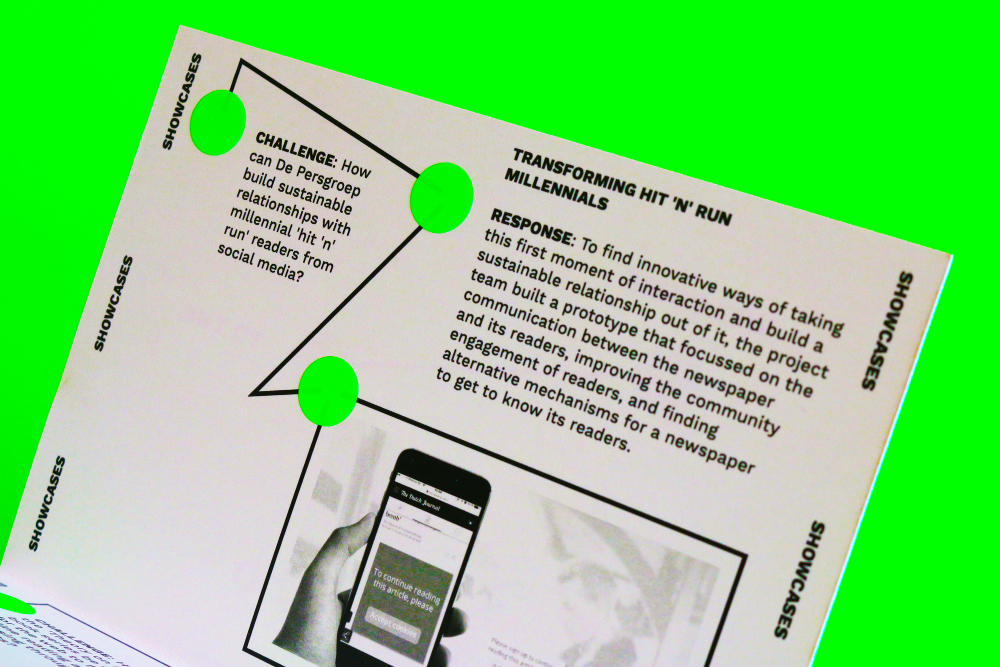
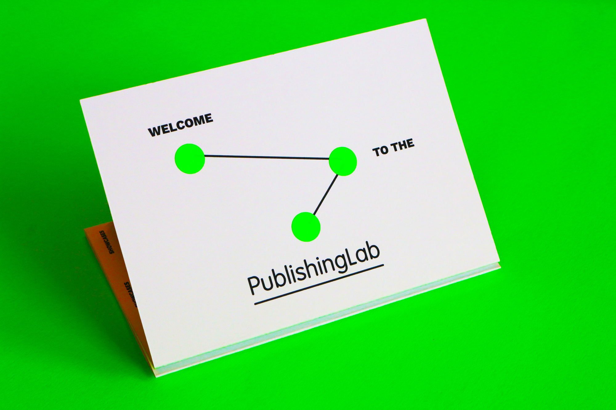
In order to reflect this ‘hybrid attitude’ in the leaflet, we were inspired by the multiple types of relationships between different elements, represented as arrows or lines connecting two or more points, visual items that resonate with the PublishingLab workflow.

The neon green is the color that vividly characterizes the PublishingLab since it’s present in almost all of its outputs. However, this color is often difficult to obtain when low print-runs are required. This technical limitation became the opportunity to experiment with an hybrid production method that mixes laser printing and the manual insertion of office color coding dots.